First Impressions Trailer from Alex Simpson on Vimeo.
Wednesday, 31 March 2010
Mood Boards and animatic
This is my animatic for Frist Impressions


These are my mood boards that gave me ideas for my trailer. helped me know I wanted to do a Rom-com.
I looked at all different trailers, so that I knew exactly what I wanted to do. Some of the films I really looked at where 'P.S I Love You', 'Pretty Woman', 'The Notebook'. These really helped me with my ideas for my trailor.

Rejected Images for Magazine and Poster

This was one of my images I didn't use. I really wanted to show the background because I thought it looked really beautiful, and showed a good love scene. However there was no connection with the reader or audience in this image. Also the way they are standing seemed a bit awkward.
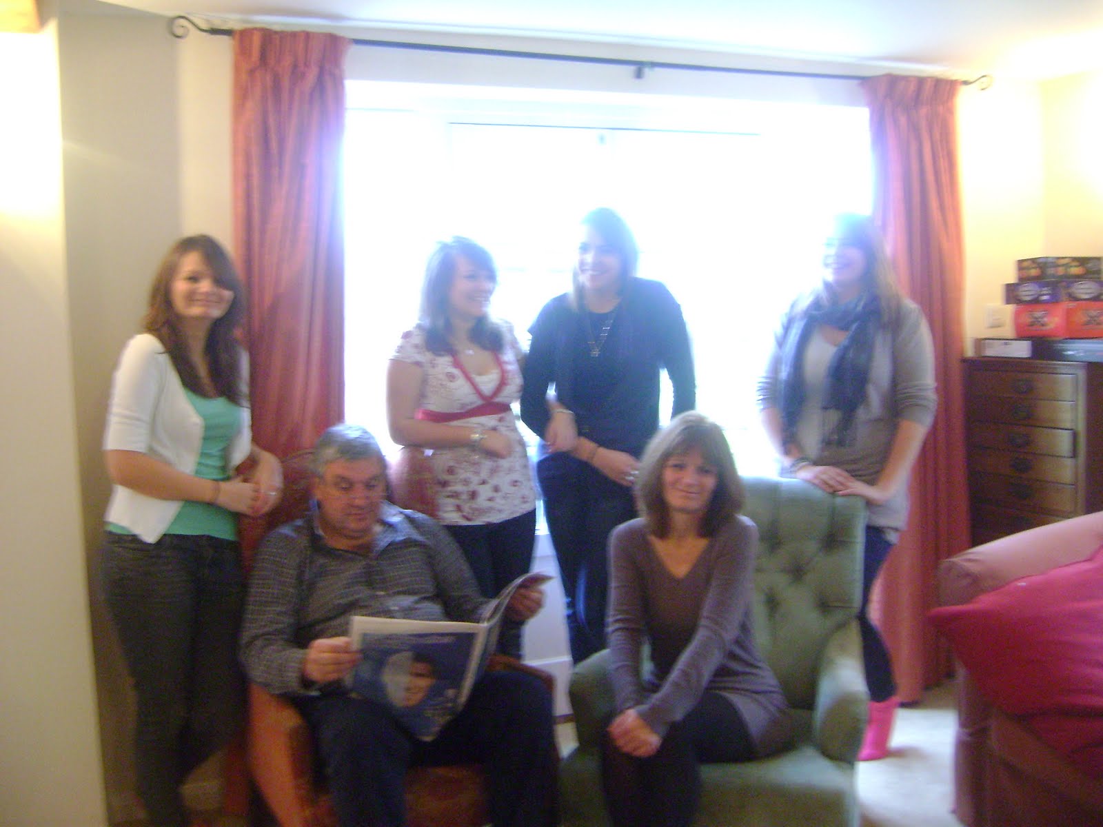
This is another image I chose not to use. I didn't use this because my magazine was mainly focusing on a couple on my front cover, and I felt that more than two people would make the front cover too busy. Also the picture is not very well taken with the light in the background to how everyone is positioned.
Poster for First Impressions
This is my Final poster for First Impressions. In the end i wanted both Characters looking at the camera. I really like this picture as it has the light right on the characters, makes them stand out more.
This poster would be a billboard poster. So if people just took a quick look at it they would know what it was. Having them both looking at the camera will help with getting people to notice it.
The poster makes it loke like a happy love story, as there is a female and male character on it, also the colours are bright this also shows it. looks like a rom-com.
This poster would be a billboard poster. So if people just took a quick look at it they would know what it was. Having them both looking at the camera will help with getting people to notice it.

The poster makes it loke like a happy love story, as there is a female and male character on it, also the colours are bright this also shows it. looks like a rom-com.
Draft Poster for First Impressions

This was my first draft for my poster. I was not sure what I wanted maybe the female character looking up at the male and the male connecting with the audience. I new I wanted some sort of a logo, to make people want to see the movie.
Magazine Cover for First Impressions
 This is my final magazine cover. I changed it a lot from my first draft. I added in a bit of colour this can catch the readers eye. I chose blue because it went well with what the people on the magazine our wearing. Over all I am happy with the way it looks.
 Draft magazine cover for First Impressions
This is my first draft for my magazine cover, I new I had to add a lot to it. I was not happy with where the writing was positioned . However I was very happy with the picture. I thought of the title because I didn't want to go for something that would be very typical for a film magazine and as I was making a trailer I thought it would be perfect.
I wanted to add another movie it the magazine somewhere, as my main audience would be female I thought the film 'Sex and The City' would be perfect.
The picture I chose was to show a bit about the movie. It shows some sort of relationship between the two characters in the film. This keeps the audience wanting to know if there really is 'love off the screen'. As the female character is looking the the camera this shows a connection to her and the readers. The male character is looking away but towards the female a bit this shows a certain sort of mystery that the reader would want in there male character.
 . However I was very happy with the picture. I thought of the title because I didn't want to go for something that would be very typical for a film magazine and as I was making a trailer I thought it would be perfect.
I wanted to add another movie it the magazine somewhere, as my main audience would be female I thought the film 'Sex and The City' would be perfect.
The picture I chose was to show a bit about the movie. It shows some sort of relationship between the two characters in the film. This keeps the audience wanting to know if there really is 'love off the screen'. As the female character is looking the the camera this shows a connection to her and the readers. The male character is looking away but towards the female a bit this shows a certain sort of mystery that the reader would want in there male character.
Monday, 29 March 2010
Magazine cover ideas

This Magazine cover influenced my ideas for my magazine cover.
For example the use of two character on the cover looking into the camera drawing the reader in. The way they are positioned shows a relationship to one another, this shows this magazine being more female targeted. The lead story is all about "New Moon", this will be mine main focus on my magazine, the Film, and how to get the reader drawn in on the magazine like this one does.
Movie poster Ideas

This is the original movie poster for Pride and Prejudice. What I mainly noticed on this poster was the use of the two main characters in the poster, the way the female character is looking back at the male. This indicates a relationship between the two. I do like this poster however I want to focus on the characters more, have them be the main part of the poster.
This is the trailer for Pride and Prejudice

This is the DVD cover for The Wedding Planner. This gave me ideas of how I wanted to do my Movie Poster. The pose of the couple and the way she is looking up gave me the idea for mine. The way the female character is in front of the male indicating she is the main character. The use of a slogan along with the title of the film draws the audience in, makes them wonder what the other events are.
This is the trailer for The Wedding Planner
My influence was from the trailer for the popular Rom-com "The Wedding planner".
A convention I want in my trailer was the use of the editing. For example they way the trailer flows I want to make sure my trailer flows the way this one does. I want make things run smoothly, as to everything cutting randomly.
Another convention I want to use was the use of close-ups. In the The Wedding planner trailer, there are a lot of close ups of the main characters. This gives the trailer a more personal feel and allows the audience to connect with them and recognise them as the main characters, I want to do this by focusing on two main characters and focusing on there story and relationship together.
I also want my soundtrack to flow well with the mood for my trailer. As I want it to focus on two main characters, I want a soundtrack that has conflict but also love in it. getting the audiences attention.
Subscribe to:
Comments (Atom)